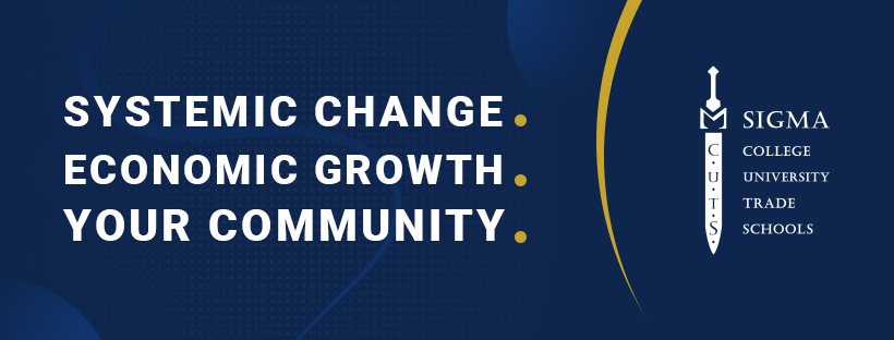
Sigma C.U.T.S. is a non-profit startup that aims to effect positive change in Arizona's communities by providing access to healthcare, no-cost housing & education.
As their graphic designer I researched the non-profit, education, and medical spaces to curate the proper look and feel for each of the programs put in place.
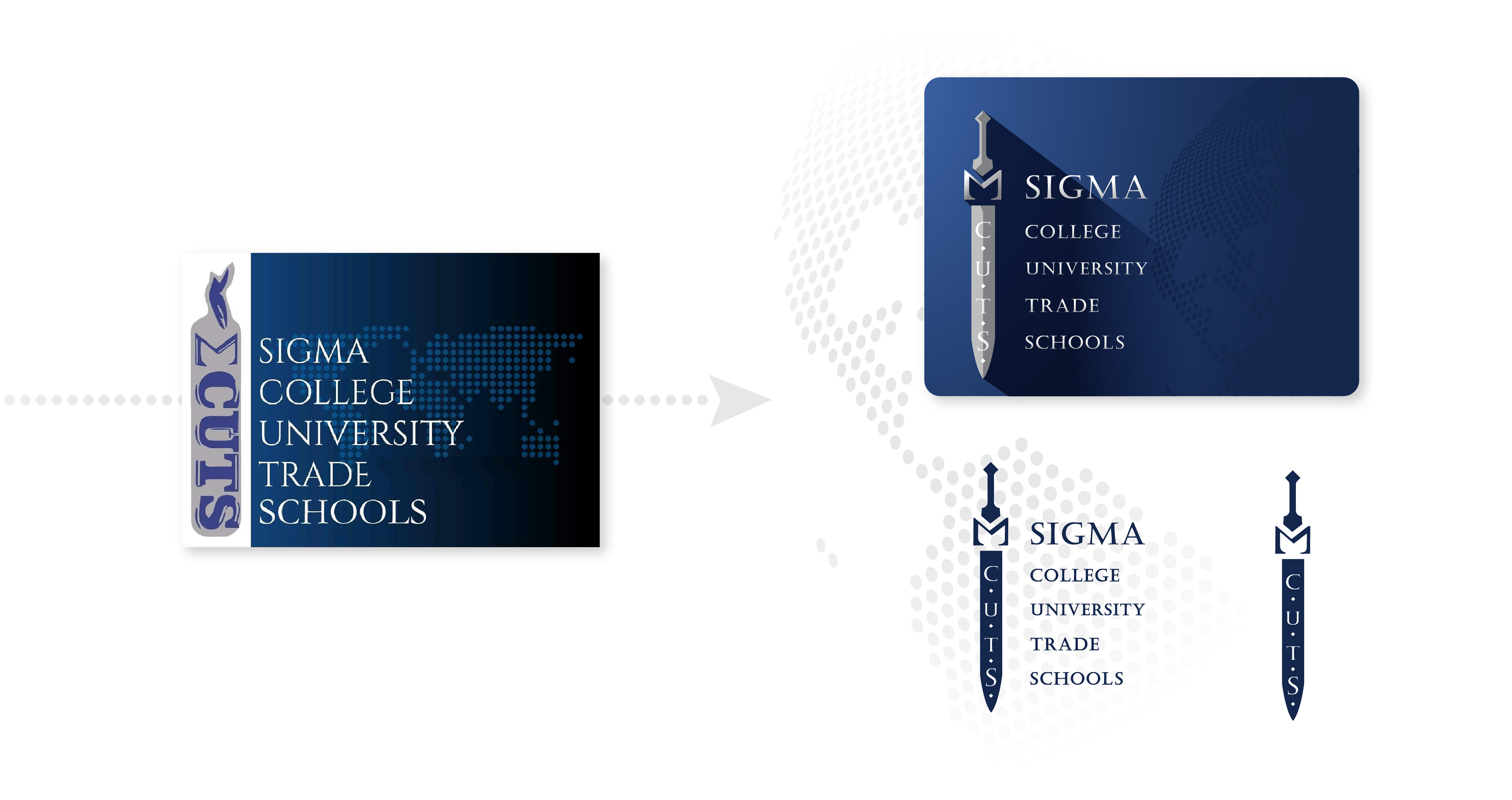
Sigma Cut's logo is a reference to the founder's college fraternity, Phi Beta Sigma. Originally the icon was a paddle, but was later changed to a sword. The sword symbolizes the virtue that knowledge is a mighty weapon.
When I was on-boarded I was tasked with updating their old logo, while maintaining the general composition. Their old logo wasn't cohesive so I tidied up the colors, and introduced some drama with lighting coming in from the left.
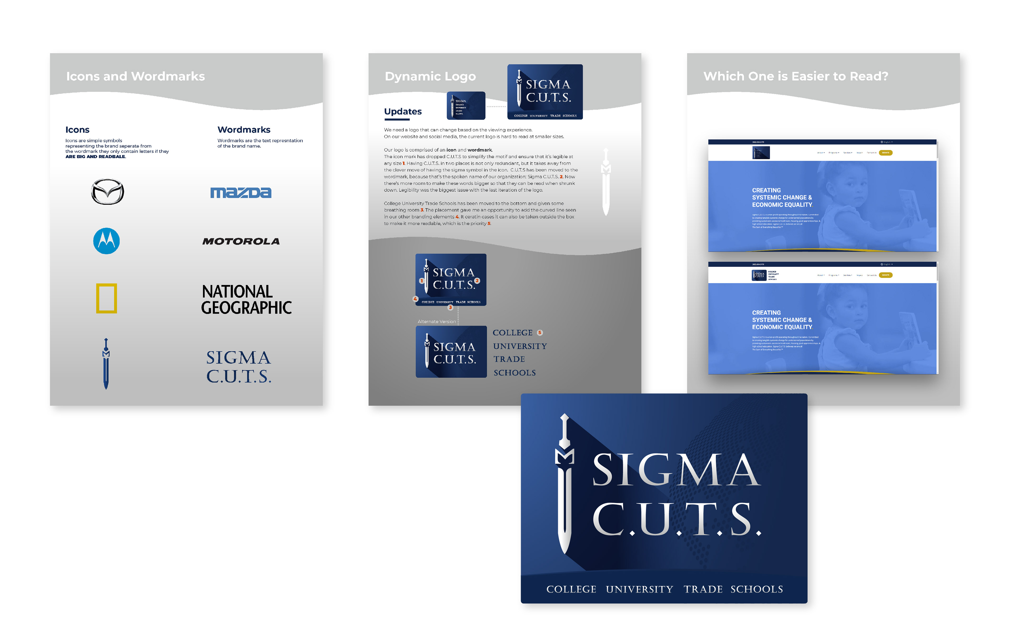
As the brand evolved, readability issues came up on the website. The logo's text was hard to read at smaller sizes. Upper management was firm on keeping the design the same so I proposed that the logo's text scale dynamically across desktop and mobile devices.
I aimed to deliver an update that made the logo easier to read, and much sleeker.

The Preparatory High School, Medical Training Academy, and Multimedia Marketing Agency are all brands that stem from Sigma C.U.T.S. I designed these logos and fleshed out their respective brands referencing the parent company's brand guide.
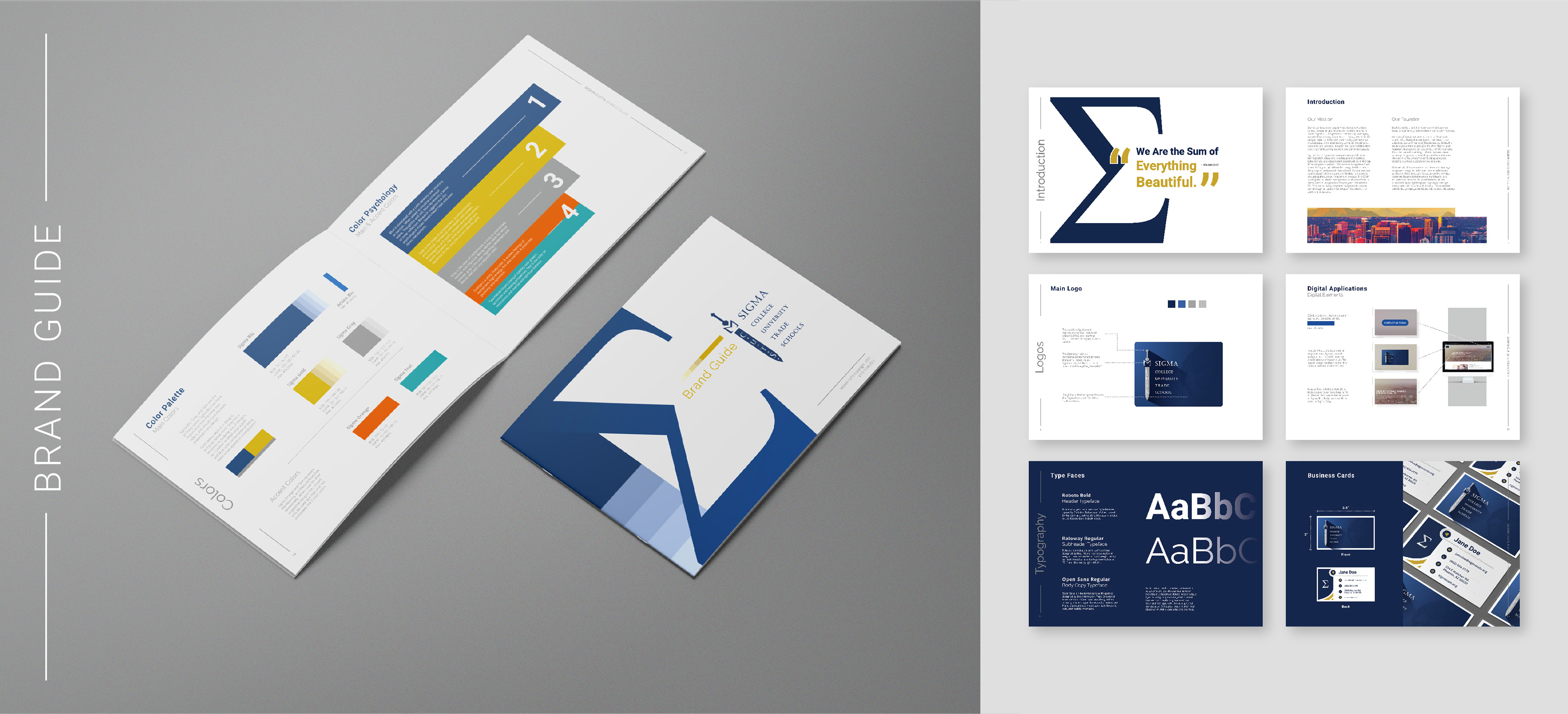
For the brand guide I curated the colors, typography, and photographic imagery, and arranged them in a way I knew would play well for a respectable non-profit. In the early stages of shaping the brand I discovered that blue and gold not only play well together, they also fall under collegiate branding. Perfect.
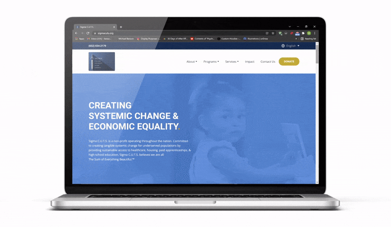
The Sigma C.U.T.S. website was designed with three things in mind. First, present the brand in a way that establishes trust. Second, drive leads to the donate button. Third, turn filled out forms into email conversions.
Donations are vital in the brand's current stage. So any potential donor who visits the site has to trust the legitimacy of the brand, understand its values, and be gently prompted to donate.
The donate button appears two times on the landing page. The first instance is in the navigation bar and the second is in a parallax section midway through the page. Once clicked on, users are led to the donation page and form.
Once filled out, further personal information is asked for in a secure window. With our form linked to Hubspot, we're also able to track email addresses and target them down the line.

This was one of the first iterations of the landing page. After discussing the general purpose of our landing page with the creative director, I outlined the structure for the page. One of the biggest challenges was finding a way to incorporate the blue and yellow arch used as a design motif in earlier designs.
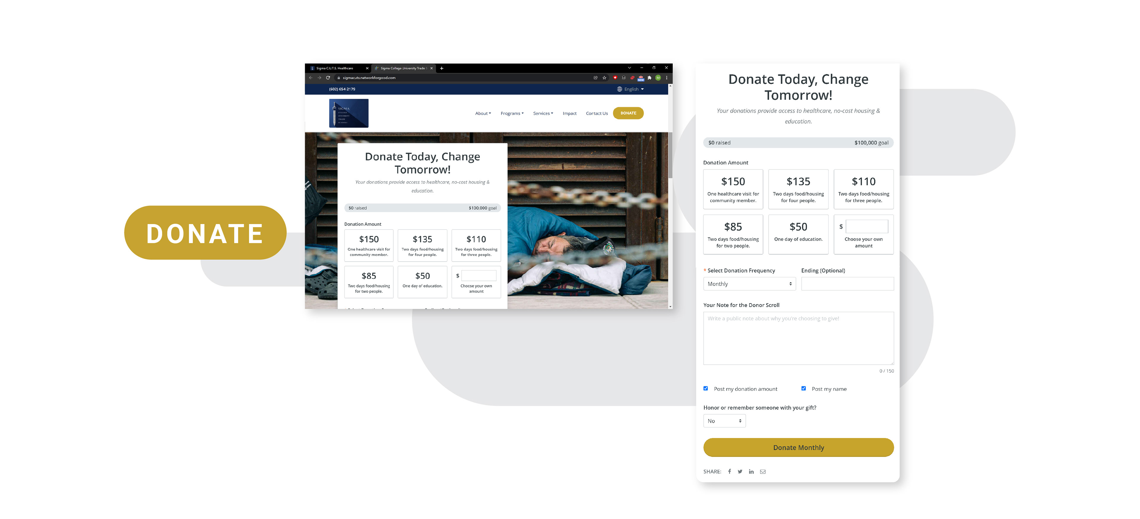
With a logo and website established, I worked diligently to create social media pieces to raise awareness for the brand. I tried to emphasize the brand's heart as much as I could with each post.
The challenge for any brand is consistently creating engaging content. I used a combination of motion graphics, branded imagery, and vector graphics to add as much flair as I could within the deadlines and brand guidelines.
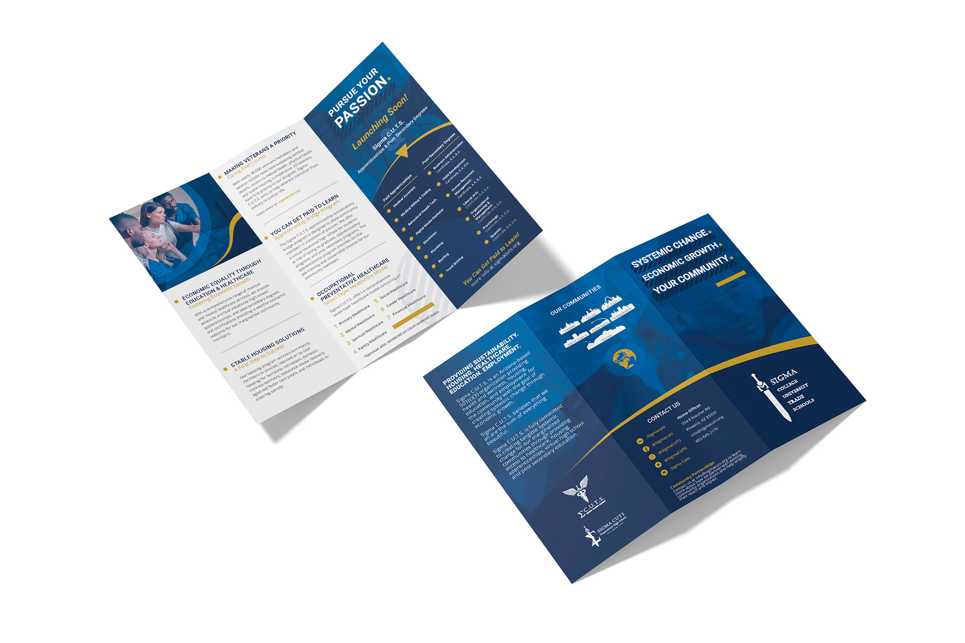
Along with digital branding there comes printed collateral of course. The trifold pictured above is a combined product of my favorite Sigma elements. In this design I feature our signature blue and yellow arch, our logos in clean white, and our curated imagery in interesting ways.

Thank you for reading about my time with Sigma C.U.T.S. This brand had a lot of potential that I diligently worked toward. I honestly believed in the brand's values and was honored to have shaped its aesthetic. Unfortunately, the brand is no longer able to operate.
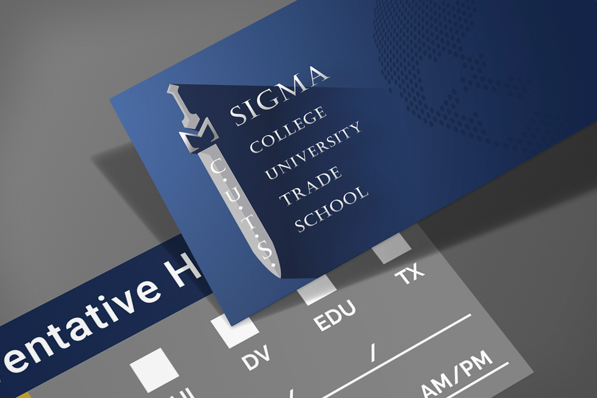
Otherwise we may have seen the these business cards be handed out for brand awareness.