"Reaching a Younger Audience"
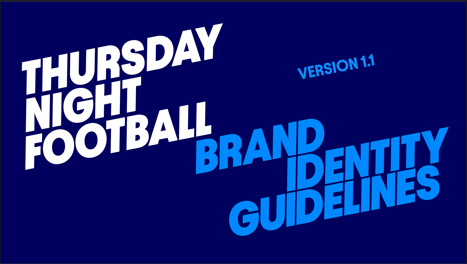
Visual spectacle was crucial in Thursday Night Football's second season. With neon visuals at the forefront of the brand guide, I knew we'd reach that younger audience with bright colors and unparalleled energy. This season was all about hyping people up.
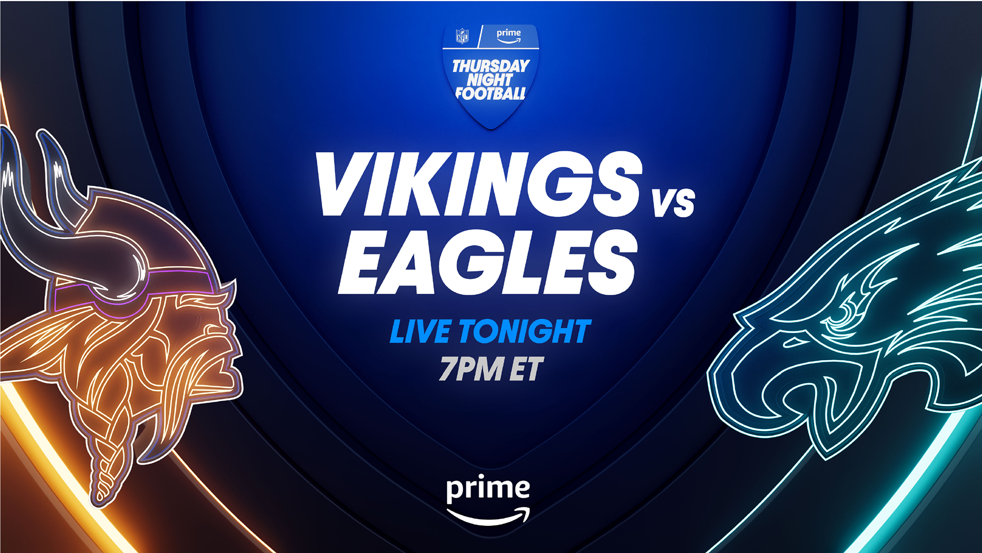

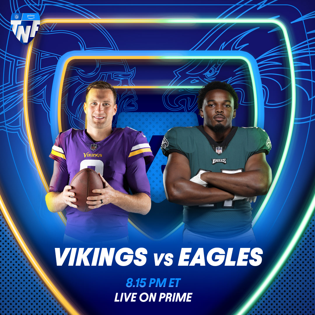
Starting with TNF's brand guide, I translated the brand's 3D neon aesthetic into pieces like the matchup graphic above on the right. I tried to utilize every interesting visual asset at my disposal. I wanted to bring out the textures, 3D depth, and lighting; all of these elements combined create a compelling image.

TNF's main key art pieces were visualized as weekly matchup graphics. My job was to reformat each image to work across all digital platforms. Everything from the Prime streaming service to the You Tube banners had to look uniform, and in some cases, translated into Spanish to reach a larger diverse audience.
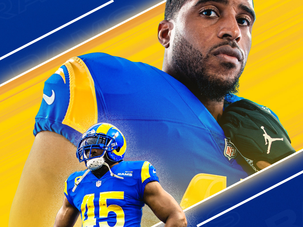
The neon aesthetic carries on to these static graphics as well. With the Titans, Packers, and Chiefs I dove deep into each team's branding and voice. The goal was for each team piece to be a paid partnership, and each piece was received well on the teams' fans on their social pages. Last season the Chiefs were red hot, and it was cool to put together a dynamic duo graphic for Travis Kelce and Patrick Mahomes.
No one really likes being hit with ads, but I enjoy the challenge of making an ad fun for a viewer. Starting with a custom end card I rendered in After Effects, I made a short opt-in video with key players. To make this more interesting I placed the players on a 3D football field to give the composition and the call-to-action more depth.
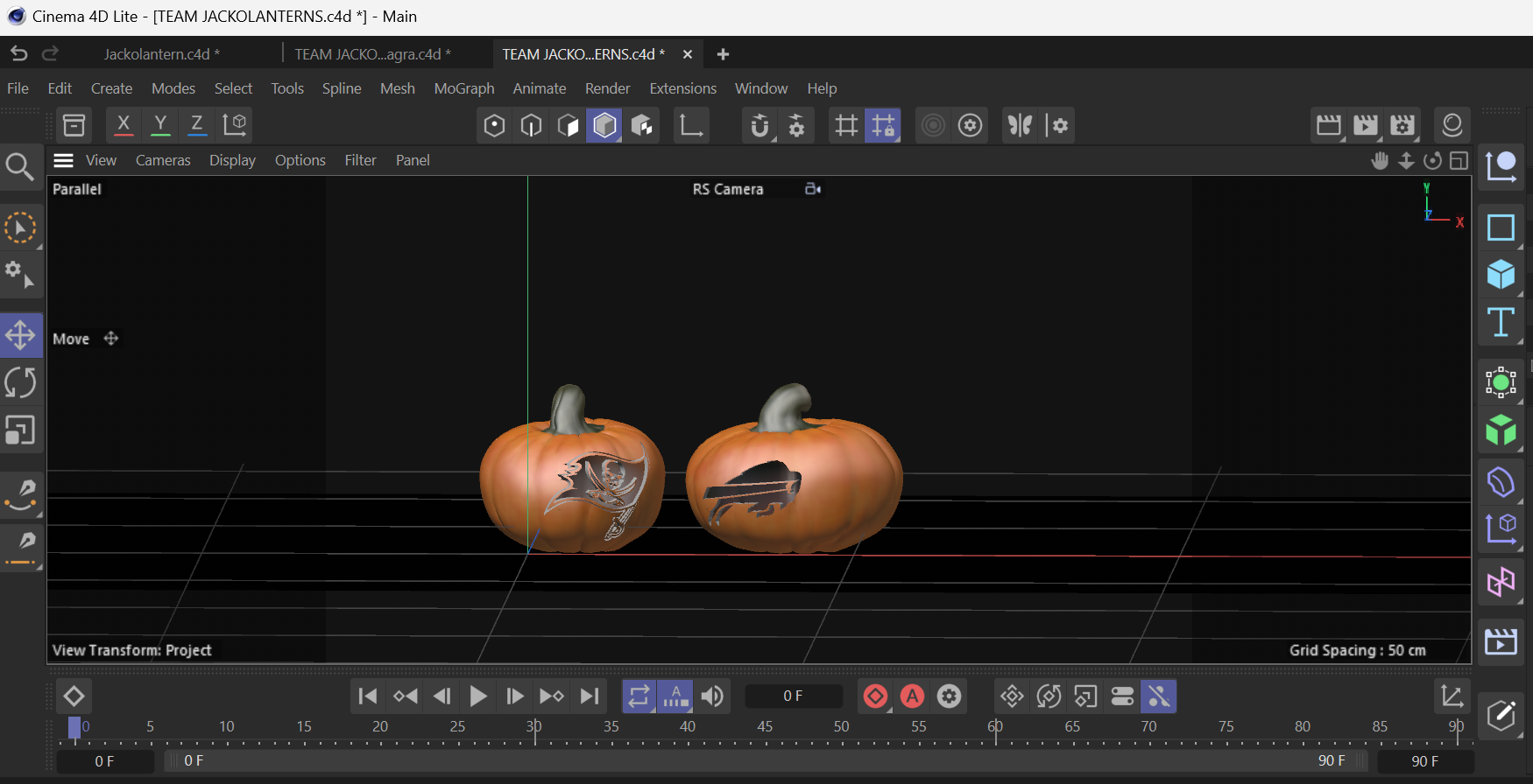
For this final piece, I'm showcasing 3D Jack-o'-lanterns I created in Cinema 4D. Using the vector Buccs and Bills logos I cut the shapes out of the pumpkins using a boolean tool. I then transferred my rendered pumpkins to Photoshop to add composite detail, and then I finally animated the video in After Effects.